Data your subscribers
can actually see
Turn customer data into personalized charts that render as images inside any email. Loyalty balances, usage summaries, progress dashboards — no scripts, no embed hacks.
Every subscriber sees their own chart
Use merge tags to personalize values, labels, titles, and colors per recipient. Show each subscriber their loyalty balance, spending breakdown, usage stats, or progress toward a goal — all rendered into a chart unique to them.
The right chart for every metric
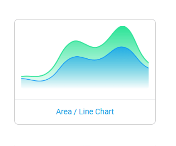
Pick from eight chart types to match the story your data needs to tell. Proportions, trends, comparisons, progress — there's a chart type built for each.
Charts powered by real-time data
Connect Data Stores, CSV uploads, or external APIs to feed live values into your charts. Show real-time inventory, live campaign stats, current loyalty balances, or up-to-the-minute financial summaries — rendered fresh every time the email is opened.
Charts that tell a personal story
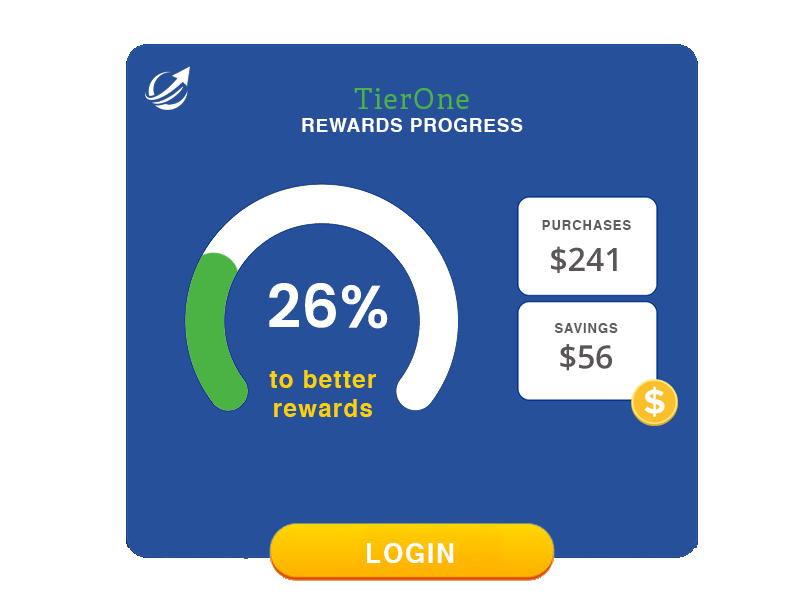
Loyalty & rewards
Show each subscriber their points balance, tier progress, and spending breakdown in a clear visual.
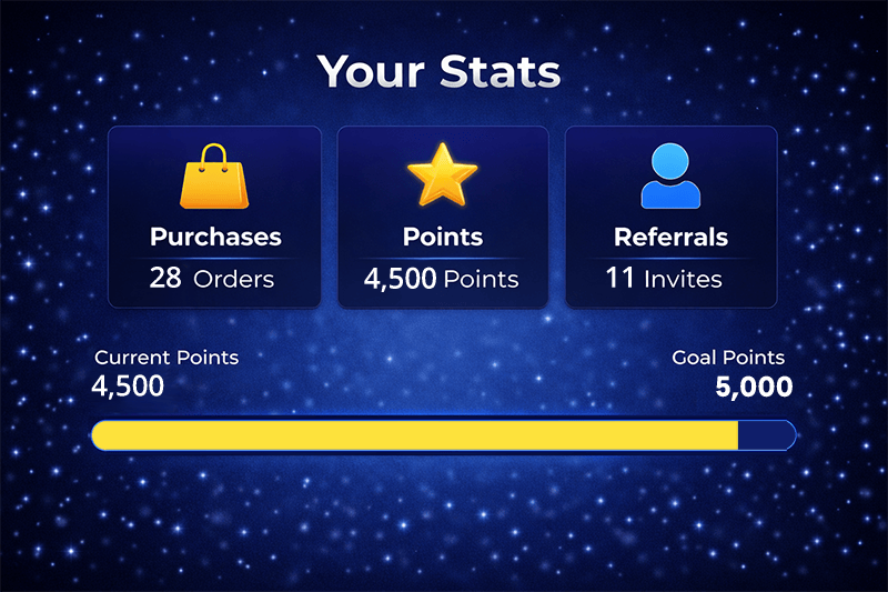
Usage dashboards
Visualize streaks, completion rates, and progress toward goals — right inside lifecycle emails.
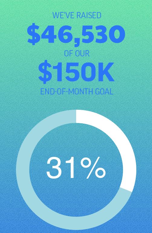
Financial summaries
Year-to-date spend, donation totals, transaction breakdowns, or investment snapshots per subscriber.
Gamification
Progress bars and radial gauges that show how close a subscriber is to their next reward or milestone.
Campaign reporting
Embed performance charts in internal reports or client-facing emails — updated with live data at open.
Education & training
Show course completion, quiz scores, or learning milestones in a visual format subscribers understand instantly.
On-brand charts, not generic widgets
Control every visual detail — segment colors, axis visibility, legends, padding, backgrounds, and image dimensions. Build charts that look like they were designed by your team, not pulled from a spreadsheet.
Charts inside personalized images
Charts aren't standalone — embed them as layers inside Personalized Images alongside text, logos, and other dynamic elements. Build rich, data-driven creatives that combine a subscriber's name, their loyalty chart, and a personalized offer in a single image.
Live in 3 steps
No developer needed. No ESP integration. Just an image URL.
Pick your chart type
Choose from pie, doughnut, bar, column, line, area, progress, or barcode. Configure values, colors, and labels.
Add your data
Use merge tags for per-subscriber values, connect a Data Store, or wire up an external API for real-time data.
Paste & send
Copy the image URL into any email template. Each subscriber sees a chart rendered with their own data at open.
<img src="niftyimages.com/c/abc123?points=%%POINTS%%" />